UI / UXwebsite design
Responsive museum website focused on clear navigation and an intuitive experience.
Duration
2 weeks
Year
2025
My role
UI / UX Designer
(Individual Project)
Tools
Figma
Adobe Illustrator


Problem
Museum websites are often outdated, confusing, and difficult to navigate. Visitors struggle to find essential information such as ticket prices, opening hours, and current exhibitions, which leads to frustration and a poor planning experience.
Goal
Design a clear and modern museum website that makes key information easy to access and supports seamless visit planning.
The experience should be intuitive, visually engaging, and optimized for all devices.
Research insights
Understanding user needs through interviews and surveys.
⸺ Outdated design
Old visuals reduce trust and fail to reflect the quality of the museum.
⸺ Confusing navigation
Users struggle to find ticket pricing, events, and contact details.
⸺ Poor mobile experience
The site is not optimized for smaller screens, therefore it is hard to use.
⸺ Lack of engagement
The experience does not encourage users to explore or purchase tickets.

Persona: Lana
Lana is a freelance content creator who wants to plan museum visits efficiently.
Needs
• clear information
• intuitive navigation
Frustrations
• cluttered layouts
• time-consuming browsing
User Journey Map
Understanding Lana's experience of purchasing tickets.
Key insight: Users feel confident at first but lose clarity during planning due to poor information structure.
STEP 01
Explore exhibitions
Tasks
Browse current and upcoming exhibitions and explore featured artists.
Feeling
Interested, confident
Opportunity
Add filters and improve previews to make browsing easier.
STEP 02
Plan the visit
Tasks
Search for the museum website and find key visit information.
Feeling
Motivated, slightly lost
Opportunity
Improve navigation and clarify essential visit details.
STEP 03
Buy tickets
Tasks
Select a date, choose a ticket, and complete the purchase.
Feeling
Focused, confident
Opportunity
Simplify checkout and reduce friction in ticket selection.
STEP 04
Navigate to museum
Tasks
Use maps, check transport options, and save the location.
Feeling
Calm, prepared
Opportunity
Integrate Google maps directly into the website.
STEP 01
Explore exhibitions
Tasks: Browse exhibitions & artists
Feeling: Interested, confident
Opportunity: Better filters & previews
STEP 02
Plan the visit
Tasks: Find info on website
Feeling: Motivated, slightly lost
Opportunity: Clear navigation & key info
STEP 03
Buy tickets
Tasks: Select date & purchase
Feeling: Focused, confident
Opportunity: Simplified checkout
STEP 04
Find museum
Tasks: Use maps & transport options
Feeling: Calm, prepared
Opportunity: Google Maps integration
Wireframes
Low-fidelity wireframes were created to explore layout structure and content hierarchy.
The focus was on simplifying navigation and making key information immediately visible.


Usability testing
Testing revealed several usability issues related to content visibility and navigation clarity.
Round 1 findings
• users had difficulty finding opening hours
• important information was not clearly visible
Round 2 findings
• event information felt cluttered
• users expected a clearer ticket purchase flow
• lack of clear CTA reduced engagement
Before

After

Before
After
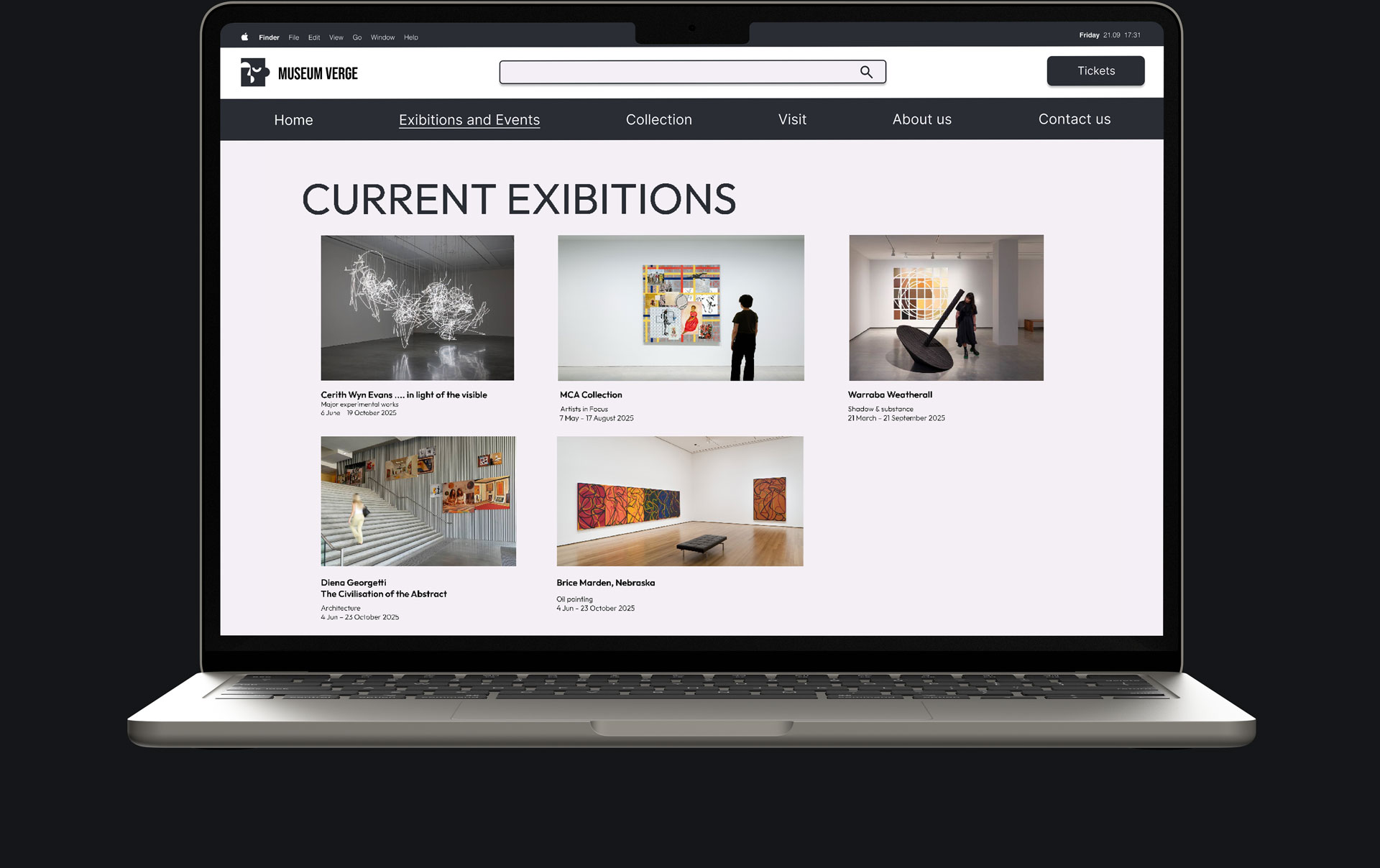
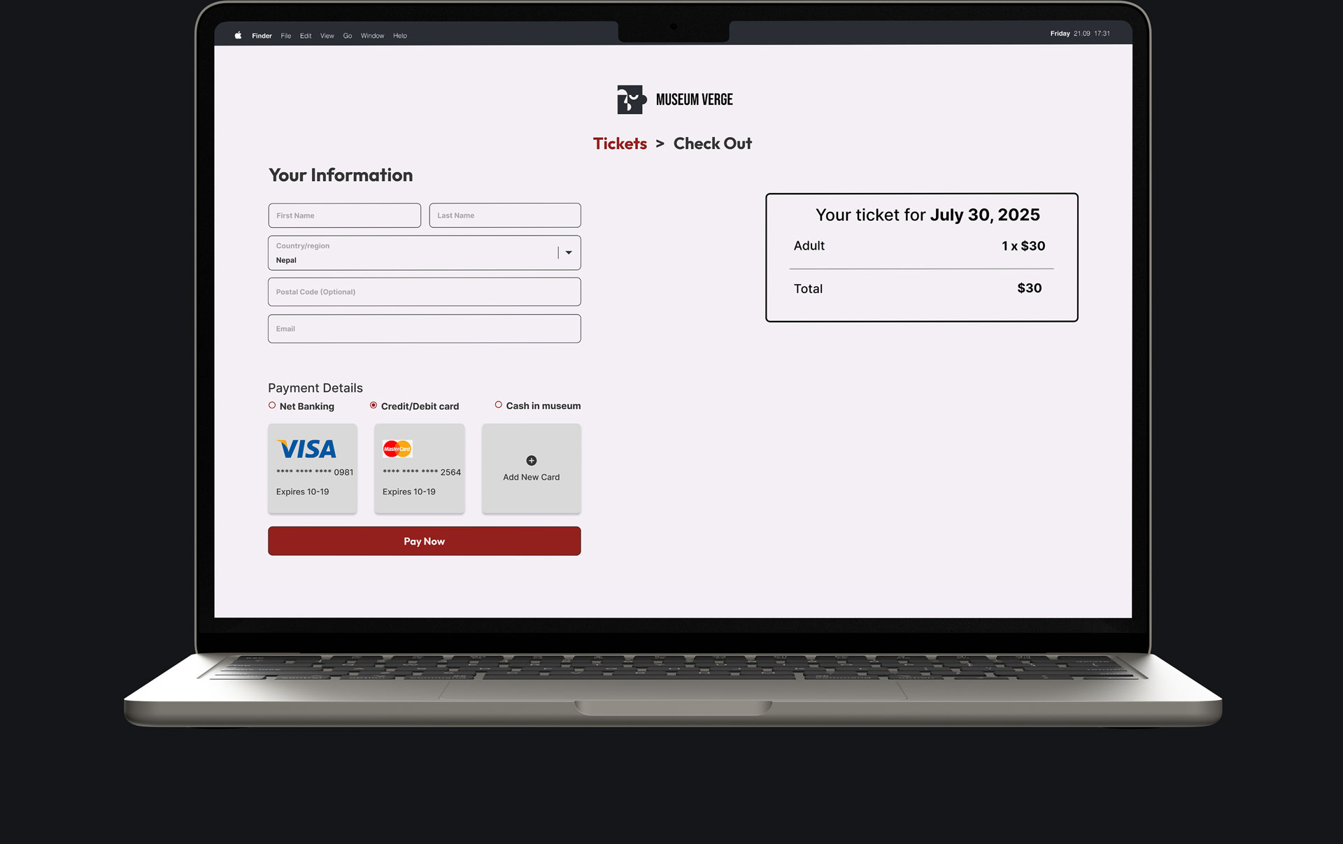
Final design - desktop
The final design focuses on clarity, strong visual hierarchy, and ease of use.
A minimal color palette and bold imagery were used to highlight the artwork while maintaining a clean and modern interface.


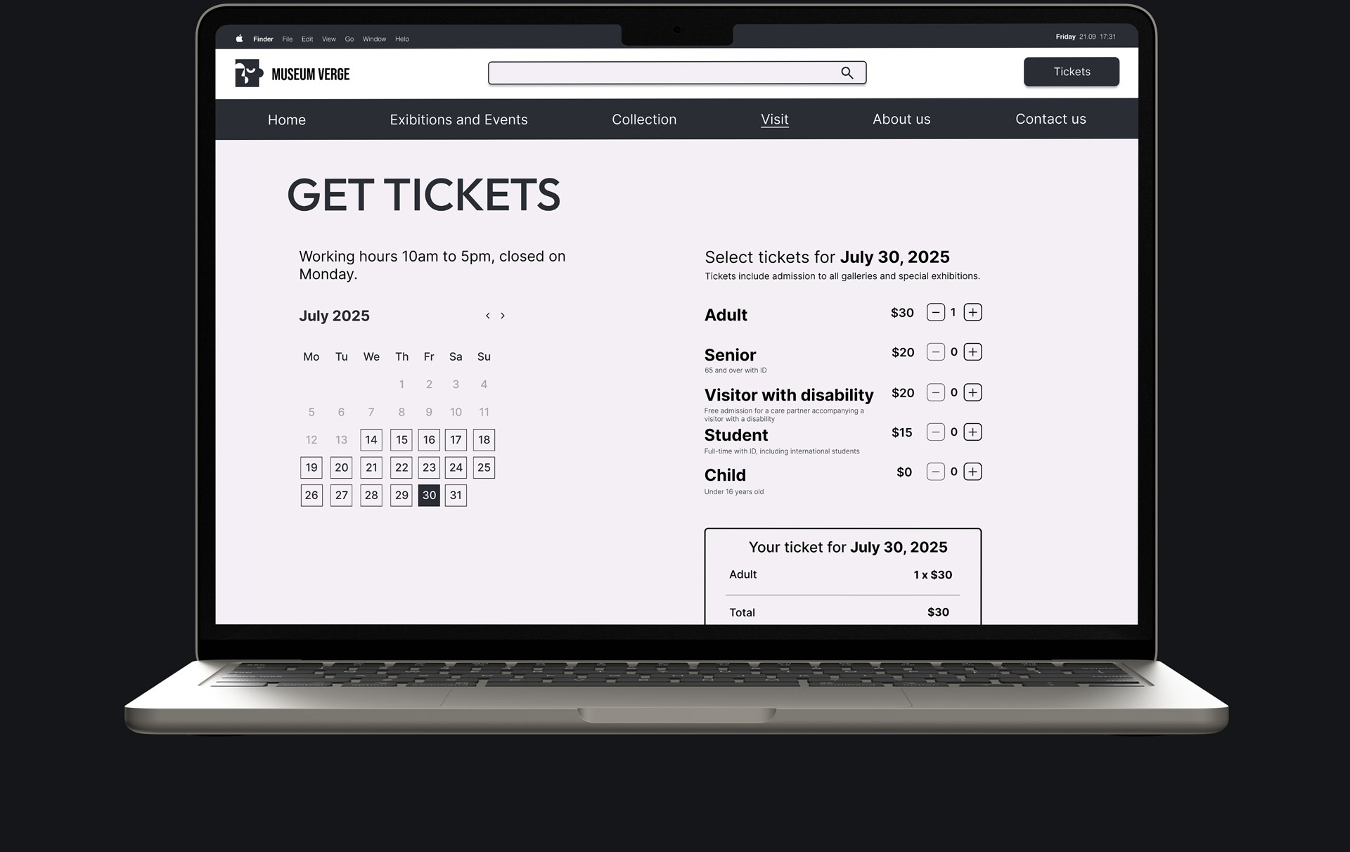

Final design - desktop
The final design focuses on clarity, strong visual hierarchy, and ease of use.
A minimal color palette and bold imagery were used to highlight the artwork while maintaining a clean and modern interface.
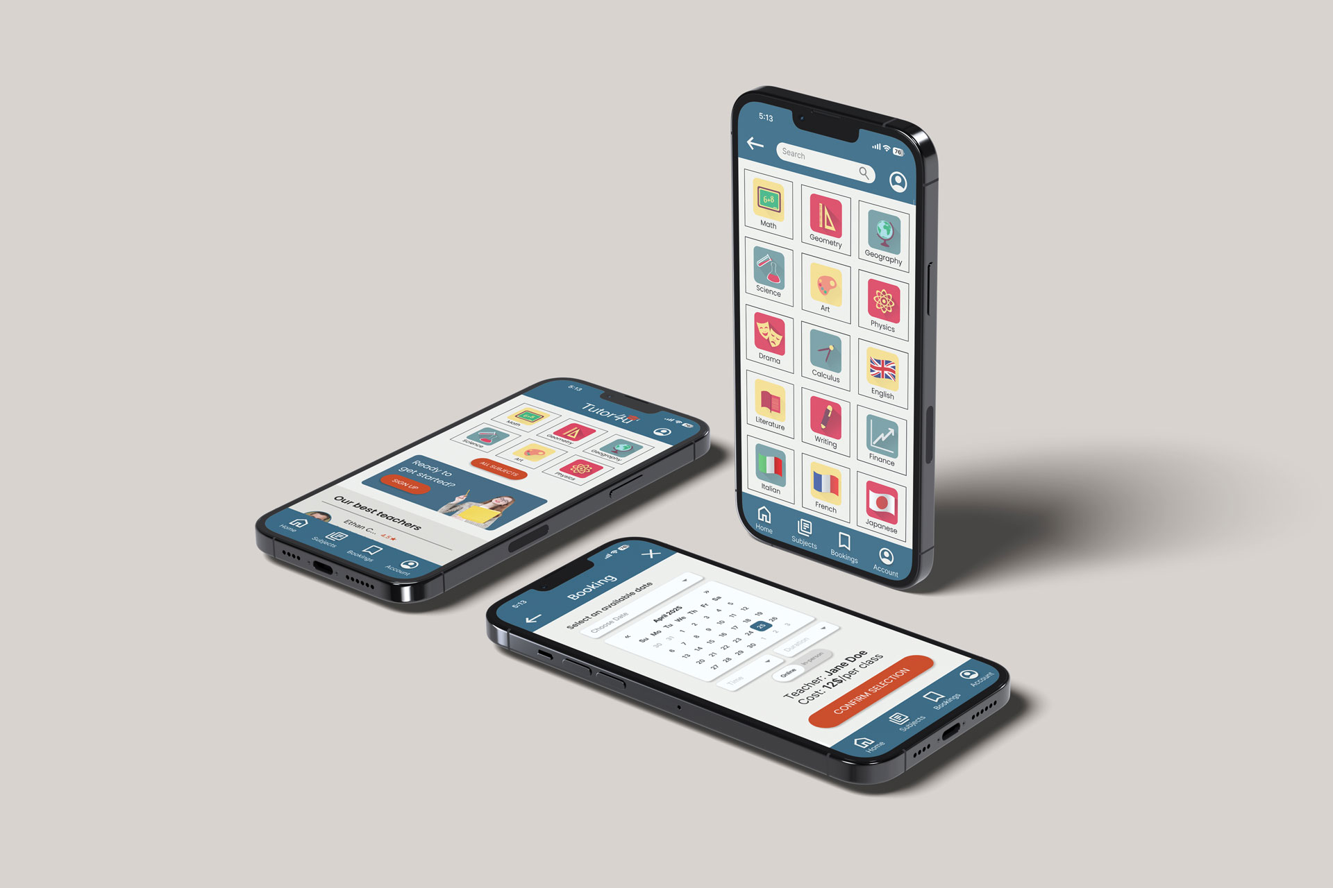
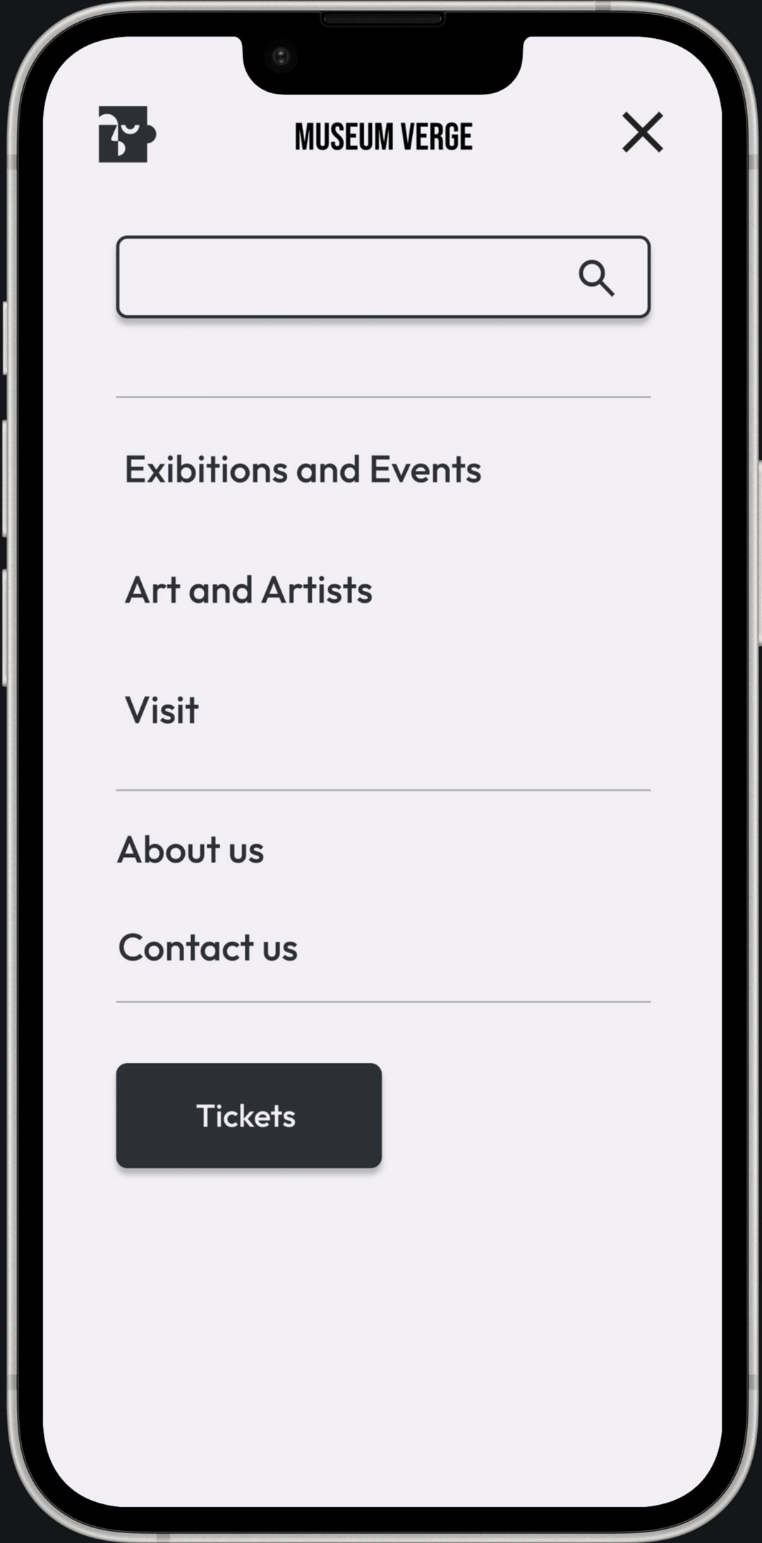
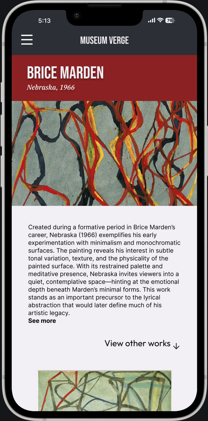
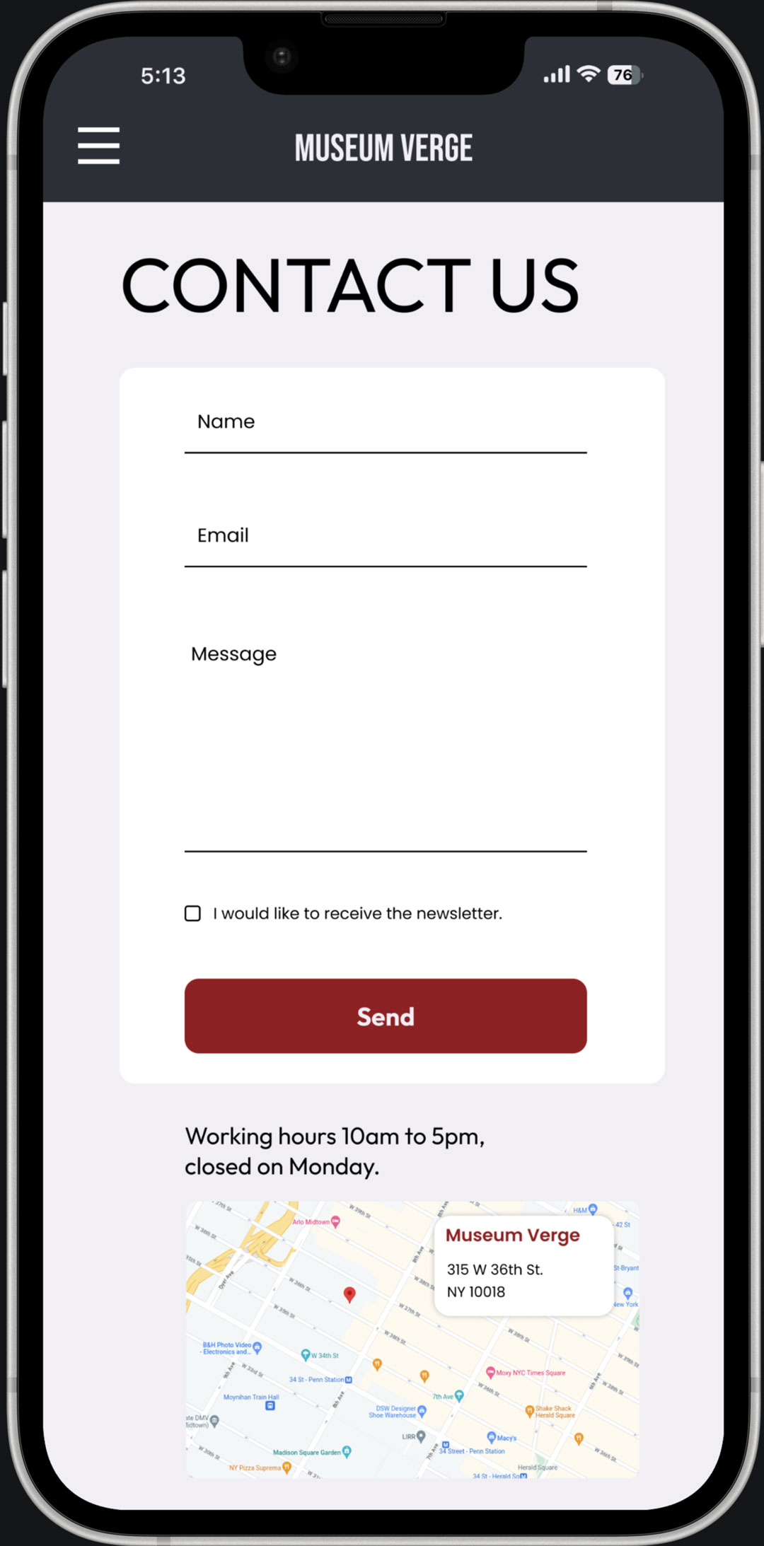
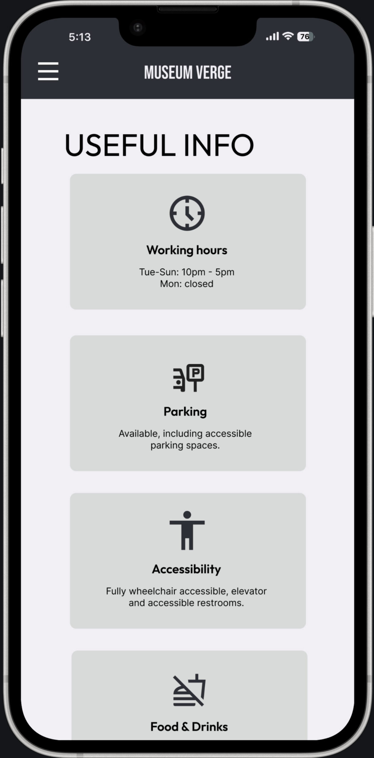
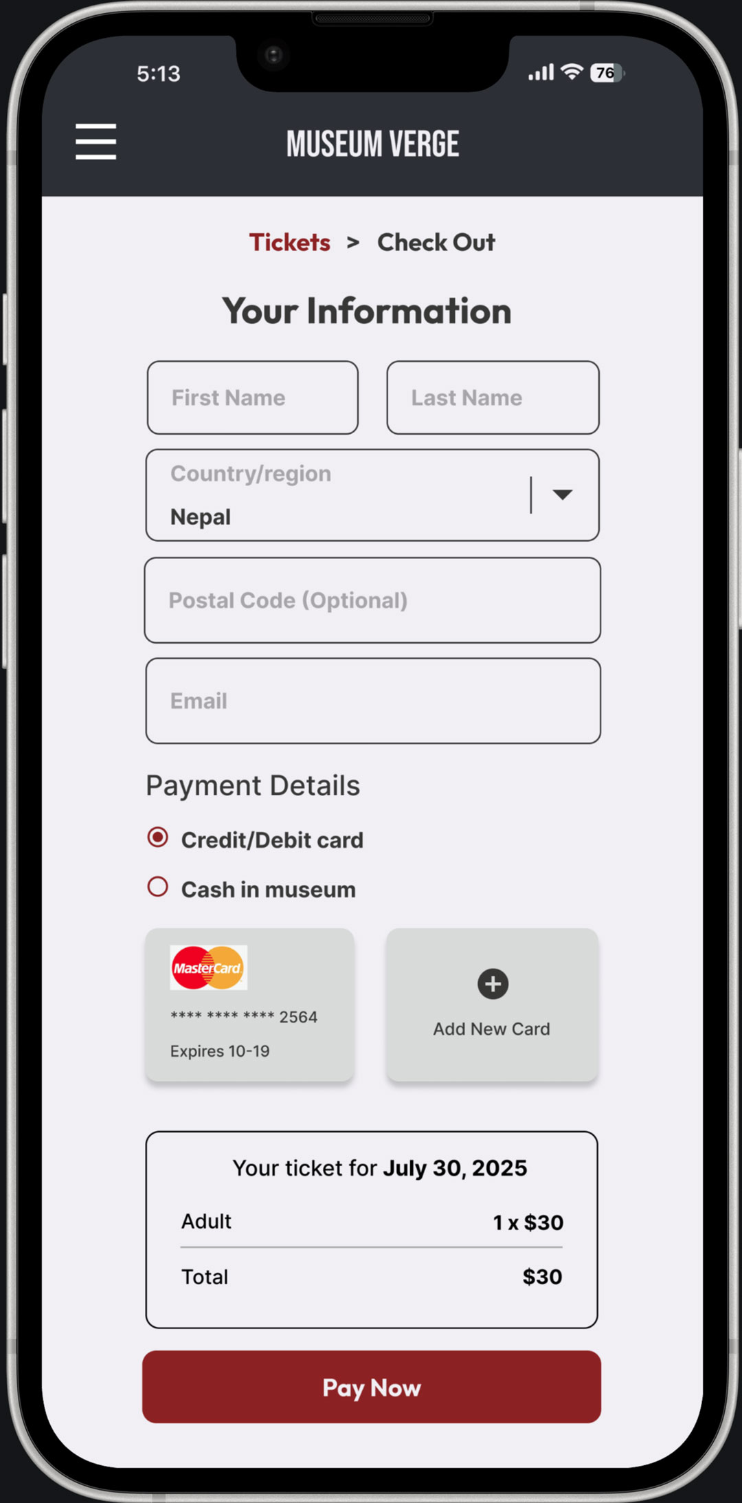
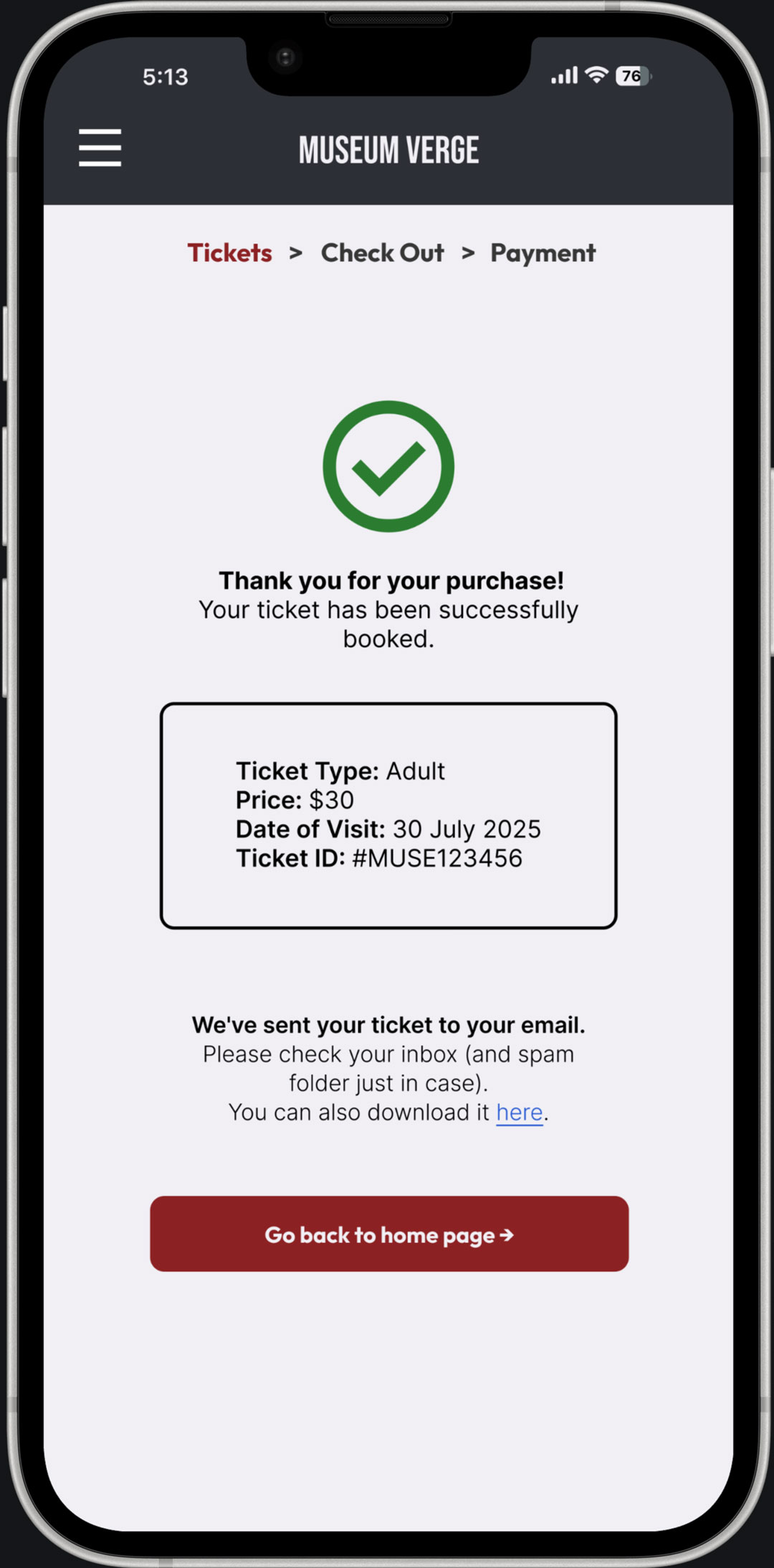
Final design - mobile
The mobile version focuses on responsiveness, simplified layouts, and intuitive navigation to ensure a smooth user experience across smaller screens.


Accessibility
The design follows WCAG AA standards to ensure readability and accessibility.
A clear typographic hierarchy and limited number of typefaces improve usability and reduce cognitive load.
Learnings
• Clear structure improves usability
• Small design decisions have a strong impact
• Accessibility and hierarchy are key
Next steps
• Gather feedback from experienced designers
• Iterate on layout and navigation
• Improve responsiveness across devices